UPAA Blog 2020-21 #27 - 6/4/21 (photos and text by Jaren Wilkey)
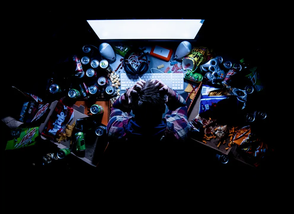
Jaren Wilkey is director of BYU photo. His General Features and Illustrations category image "Trolling" was voted best in show in the May 2021 Monthly Image Competition.
Tech stuff? What camera, lens, exposure, lighting, gadgets, gizmos, etc.?
•Canon EOS R5
•28-70mm f2 at 28mm
•1/160 f2; ISO 400
•2 Aputure MC LED lights
How did you have an opportunity to make this photo? Planned? Self-Assigned? Something else?
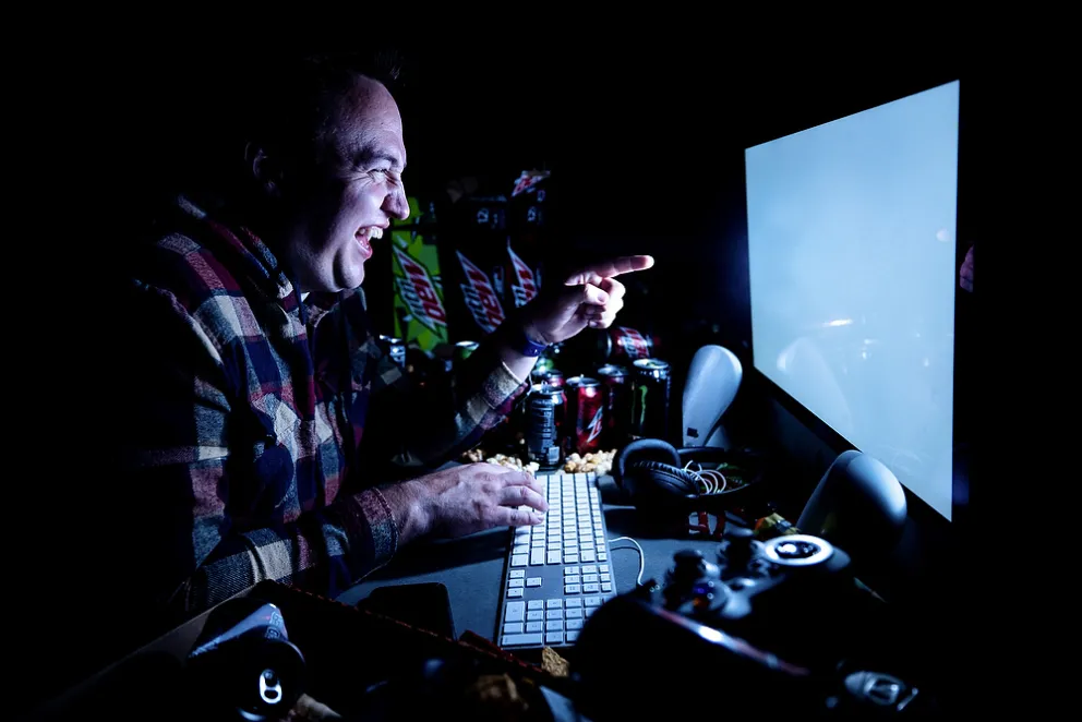
In our department staff meeting we were told about an upcoming study on internet trolls and what kinds of characteristics lead people to become online bullies. I immediately had the idea that it would be karmically appropriate to make fun of a troll by creating a photo that showed him in his cave. I imagined that somebody who lived to make fun of others would be a slob surrounded by stale food, empty soda cans and garbage. I also wanted it to be a darkened room with the only light emanating from the computer screen. The plan was to shoot straight down on the desk and arrange the props in a triangle shape to emphasize the light coming from the screen.
Any unique logistics in making the photo? What sort of post processing (or not)?
Initially I toyed around with doing the shot in our studio, but then I figured that one of our student desks would be a bit easier to dress up and make it look like a home office. We put up some black Duvetyne fabric on the background stands to completely black out the light coming from the windows. Duvetyne is what they use on film sets and there is nothing better for controlling light on set. I also used V-Flats to block light from reflecting off of our light grey office walls.
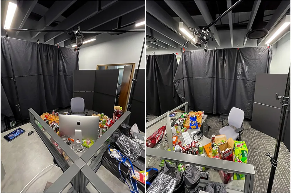
The set. Duvetyne fabric on background stands completely blacked out the windows and V-flats helped with negative fill.
Next came the props. I went full out with cheap pizza, soda, energy drinks, chips and candy, all the things you would expect to see from a reclusive troll. You can’t skimp on props, it is what determined the mood of the photo needed to make this shot stand out. I don’t know about you, but I always worry about having to justify things like this in my expense report, but I’m pretty sure that our accountants just thought I was really hungry. Truth is, I was hungry, but professionals can wait till they get the shot.
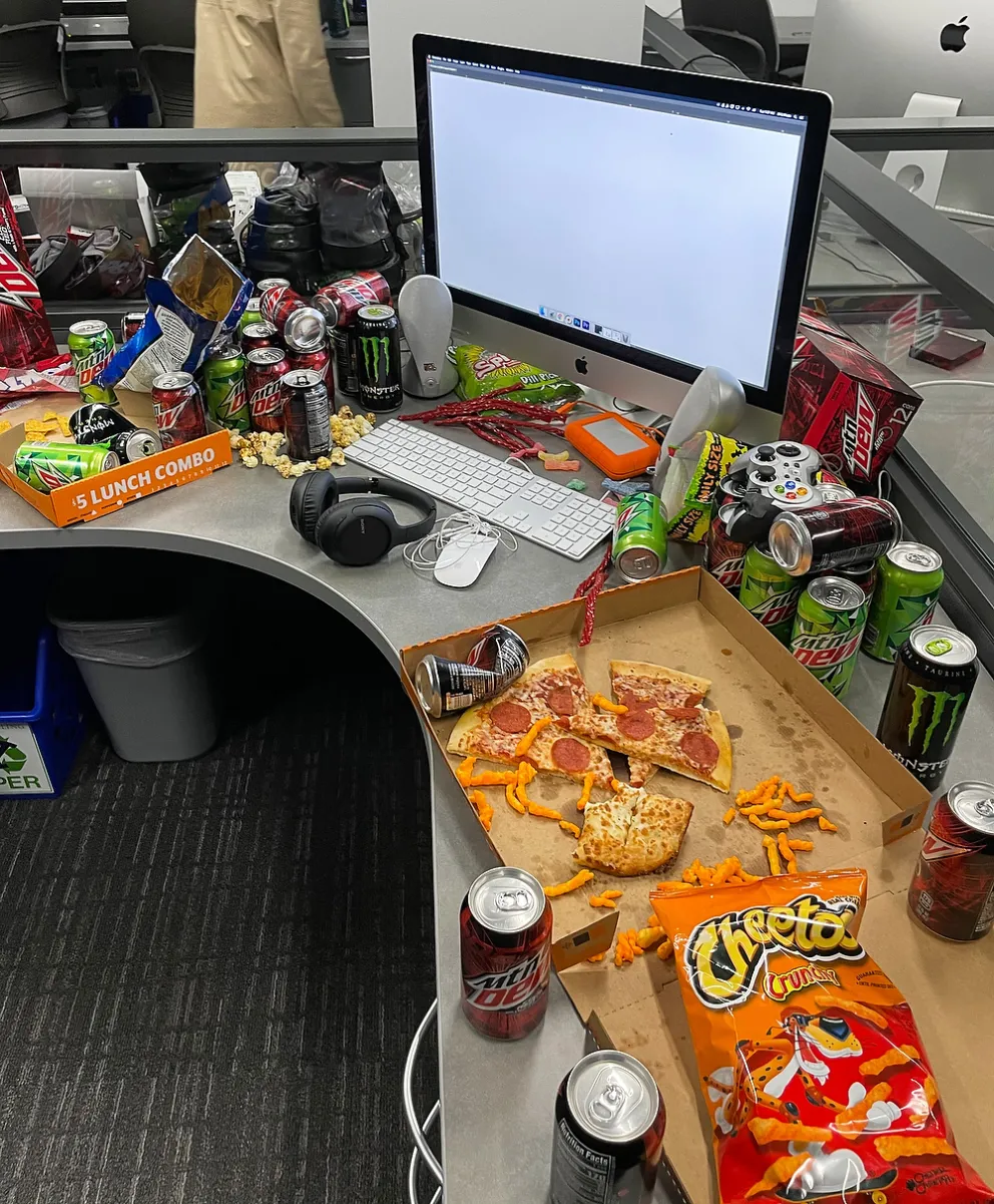
"You can't skimp on props."
We set up a few more light stands and a crossbar then attached the Canon R5 to it with a Super Clamp. I used our new Canon RF 28-70 F/2 lens because I wanted a very shallow depth of field focused on the subject and not the props. We connected the camera to our iPad Pro with the Canon Camera Connect app so that we could use Live View to make adjustments to the shot and capture the photos. The app worked great because we had to move around the props several times until we created different levels of garbage and filled most of the empty holes so that we were happy with the overall design.
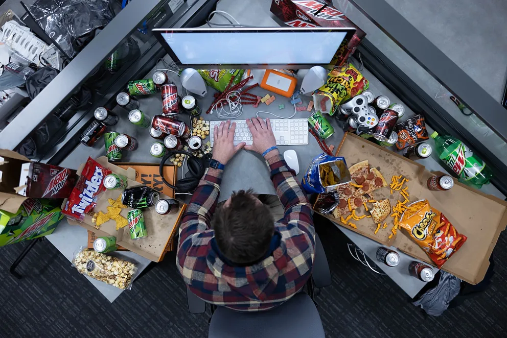
The setup with full office lighting.
Our new coworker Tyler wrote the press release and we also cast him as the model. We had him go through several poses from laughing at something on the screen to being angry. When I told Tyler to show me despair he started pulling his hair out contemplating his life choices. That was the shot. It is the moment that we really connected with.
A different angle and expression.
I knew that we wouldn’t be able to get enough light from the iMac screen, so after we got a few backplates of our final setup, I taped 2 Aputure MC LED lights to the screen with gaff tape. They boosted the output from the screen and were really easy to Photoshop out during the edit.

Left, the actual brightness from the computer screen; middle, the Aputure lights taped to the screen; right, the final image.
You chose this image as one of your 5 best of the month, and UPAA chose it as the best of everyone’s best of the month…What do you think makes it stand out?
I’m going to be honest, I’m really surprised that this photo won Best of Show. It was a lot of work to create and it’s an interesting concept but I’ve noticed that simple photos tend to do far better in the Monthly Image Competition than complex ones. I think it has a lot to do with the size the photos are displayed when we vote on them, if the photos took up the entire screen I think we would be able to more fully appreciate small details in composition, design and lighting. I was just hoping that this photo would place in the category, but I didn’t believe it had a lot of potential beyond that. This speaks to the importance of having a community of photographers that give you feedback on your work. The MIC helps me to understand which photos resonate with others, and it is even more meaningful when it is coming from my peers whose work I respect. This honest feedback is why I love the MIC and the POY competitions, judging the work of others and having my work judged pushes me to become a better photographer.
What (if anything) would you do differently if you could re-shoot this today?
One thing I would change is I would add a small piece of foam-core on the right and left sides of the Aputure lights to create a sharper falloff of the light to accentuate that triangle shape that I wanted to create. The other thing I would change would be to put the model in a simple grey or light grey hoodie, the pattern of the hoodie he wore was a bit busy and didn’t stand out from the desktop props.
__________________________________________________
"Anyone can speak Troll, all you have to do is point and grunt." -J.K. Rowling | Thanks for reading the blog. Article submissions and suggestions always welcome, email editor Matt Cashore, mcashore@nd.edu. Follow UPAA on Instagram!